I couldn't tell you why, but I think information visualization is one of the coolest things ever. With more and more information available it's becoming increasingly difficult to sort through, and the major solution to navigation has proven to be search technology (very interesting development in this forum, by the way, as Microsoft has finally unveiled their version of a search engine). It has and will continue to dominate the way in which we find things we're looking for. However, there are certain queries that cannot be answered by typing in keywords. There are many kinds of information that are far better communicated visually rather than, uh, word...ily... or something. I started thinking about this tonight after reading this article in Wired about an Electronic Arts festival in Linz, Austria.
We've all seen graphs for years; with the advent of PowerPoint, which stresses communicating in the most succinct way possible, they're becoming more and more common. At least in the business arena. Annual reports are full of bar graphs and pie charts and line graphs, all of which are there to communicate how great things are going (and in many cases, I've found that they're somewhat distorted to either minimize drops or maximize improvements... but that's another topic for another time). My statistics professor constantly emphasized "graphical excellence," and tried in vain to teach us the importance of relevant data visualization. His graphical excellence idol was a man named Edward Tufte, who wrote a couple of books on the subject and whose best example of how to communicate information graphically was this rather remarkable map of Napoleon's march to Russia and the return trip, and it shows the attrition of his troops and the corresponding temperature.
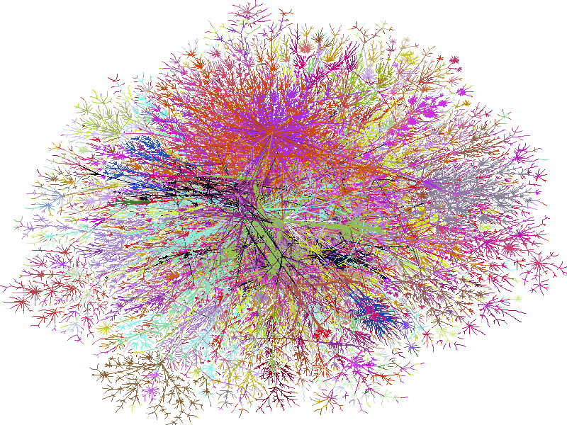
With advances in technology, we've been able to move beyond simply communicating what we already know to actually discovering new information by data visualization. One of the biggest trends is network mapping, on a scale previously undreamed-of. This is probably one of my favorite graphics to demonstrate what I mean, but there are lots more on this professor's website here, and a number of visual representations of the election results (because no one can really get enough of those) is here. I found some interactive websites that show connections: one shows how all of America's top executives are related to one another (best way to look at this one is to click 'load map' and see what you get), and another shows how various websites are related to one another. A great thread on Slashdot discusses a lot of these and talks a lot about implications, explanations, etc.
Another cool application I found was this concept called TextArc, which lays out a reading of an entire text on a single page and then reads through it, showing the connections between words and where they're used. There's a sample of both Hamlet and Alice in Wonderland, and just watching these is absolutely amazing (but only if you have high-speed internet). Unfortunately, I wasn't able to find my favorite literature example of visualization technology, which is a website where you type in an author's name and then they're shown in relation to other authors with similar content. That's useful. I'm going to keep looking.
Are any of these practical? That depends. But regardless, the most important quality of all of these is that they look really cool.
Yes, that is my actual conclusion to all this, as it's now midnight and I realize I spent the past two hours just wading through a topic that's way too dense to begin to understand at this hour, particularly when I should be applying my brain power to figuring out if/how people are loyal to airline websites, how to determine cross-channel ROI, and/or how to market E.piphany internally at Roche. Besides, writing and researching this is likely a lot more stimulating than reading more Tucker Max stories (omigod, the Austin Road Trip story is even funnier than the Sushi Pants story).
But first, other really cool links:
Keyhole.com: Satellite imagery of the entire world that you can manipulate to show whatever you want: zoom in or out, change the angle of view, find a particular address, fly across landscape
Newsmap: I've posted this one before, and I still think it's cool; incidentally, it was displayed at the Ars Electronica festival mentioned above in Linz, Austria.
Introvertster: Only tangentially related to above topic, but too funny not to post.
Update:
I knew it! Visualization software can be really useful when it comes to words (though it must suck to be the guy that does all that coding): I found VisualThesaurus.com via a link through Merriam Webster Online. You can only do one search and then you have to buy it, which is really stupid, but I love that someone's trying to market this technology (despite the fact that, while easier to use and definitely more attractive to read, it's likely far more limited than what you would have available if you bought my favorite thesaurus, which is like the most kick-ass thesaurus ever, they've got everything in there!).
Saturday, November 13, 2004
Subscribe to:
Post Comments (Atom)
Whole27: Seven (Eight?) Months Later
Breakfast this morning was cinnamon rolls. In fairness, I'm sick right now with something resembling that monster flu--hopefully it...
-
There are some movies out there that are just bad. There are some movies that make you feel violated just by making you the unwitting viewer...
-
Breakfast this morning was cinnamon rolls. In fairness, I'm sick right now with something resembling that monster flu--hopefully it...
-
I was inspired to do Whole30 by my friend JR, who is probably the sole reader of this blog (hi JR!). I had dinner with him and his lady and ...
No comments:
Post a Comment